

A family came to me and asked if I would be interested in helping them to design a trading card game.
The mom explained that her 10 year old son had devised an idea for a game that could be played like the Pokemon Trading Card Game, but would have an educational element to it.
Scope
- Logo design & branding
- Card illustrations
- Card design
- Package design
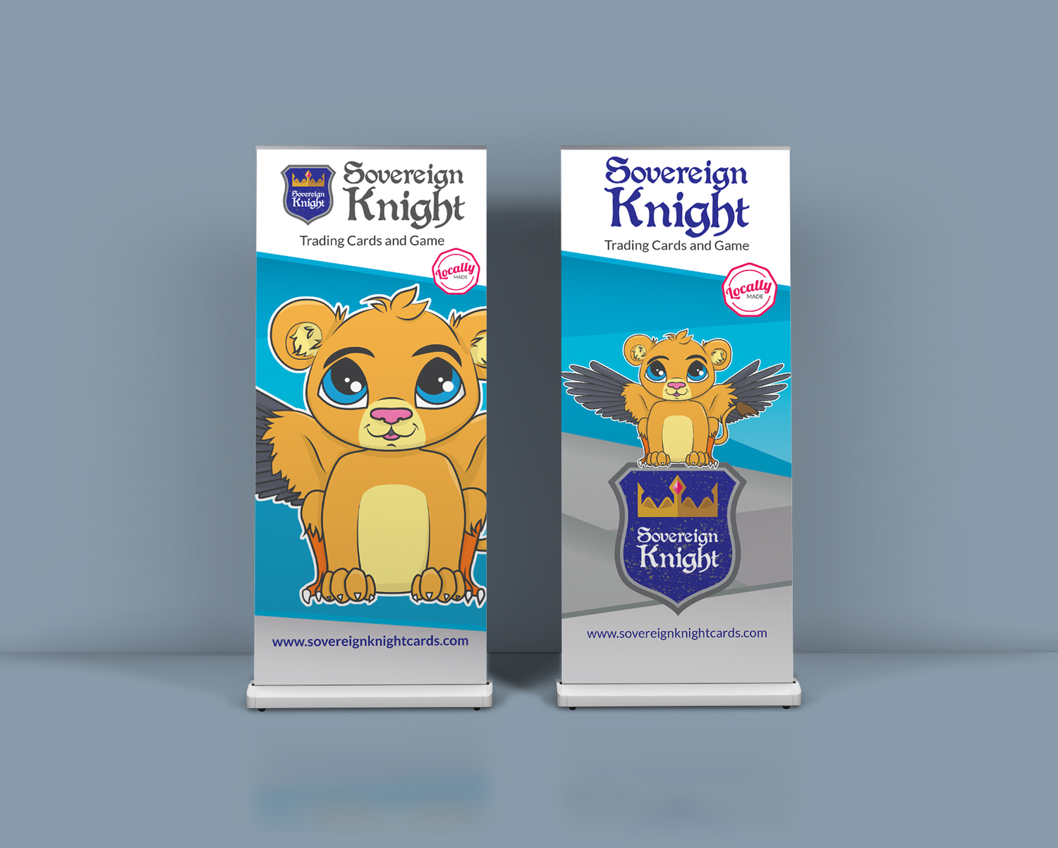
- Tradeshow banner design
1. Style and Feel
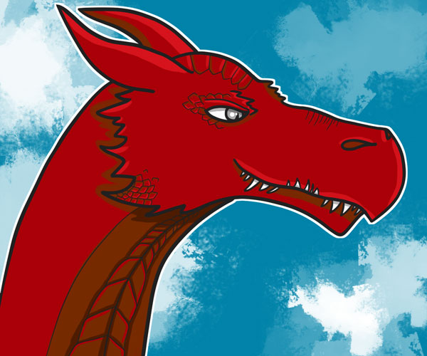
The family specifically approached me after seeing some of my illustrations online – they enjoyed the style that I use to draw animals and creatures and wanted to encorporate that into the style of the game. From here I went into information gathering mode. Who would be playing this game (target audience)? Are there any similar games (market research)? Were they drawn to particular color palettes or styles (branding)? What educational aspect did they want to include (content)?
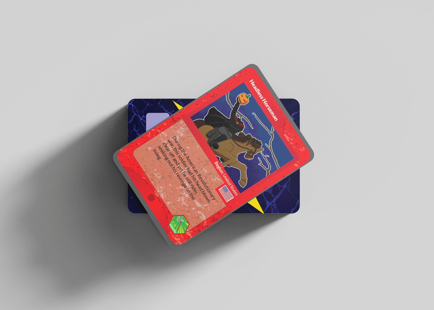
I discovered they wanted this game to be targeted to a similar audience as Pokemon Cards – ages 6+. This was crucial information as it would help me to tailor the style of the art, as well as the look and feel of the cards themselves. Brighter, more saturated colors would help capture the attention of children. Some of the characters they wanted on the cards had slightly darker subject matter (such as the headless horseman) so I had to figure out a way to make those cards not too scary so they would still be approachable by the kids.
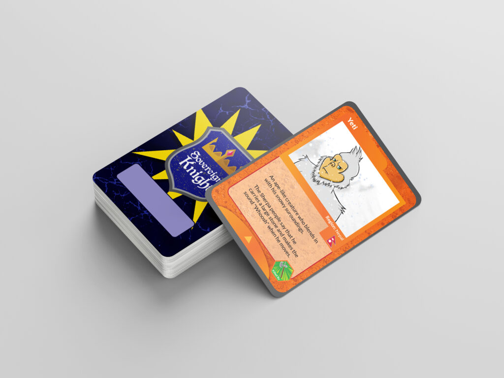
2. Illustrations & Logo Design
My first step was to nail all the illustrations for the cards. The young boy had developed a list of mythical creatures from around the world. Similar to other trading card games, some of the cards would be more powerful and rarer than others, so we had to figure out a way to distinguish those from the standard cards – we decided to encorporate foiling for those cards.
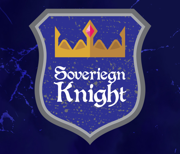
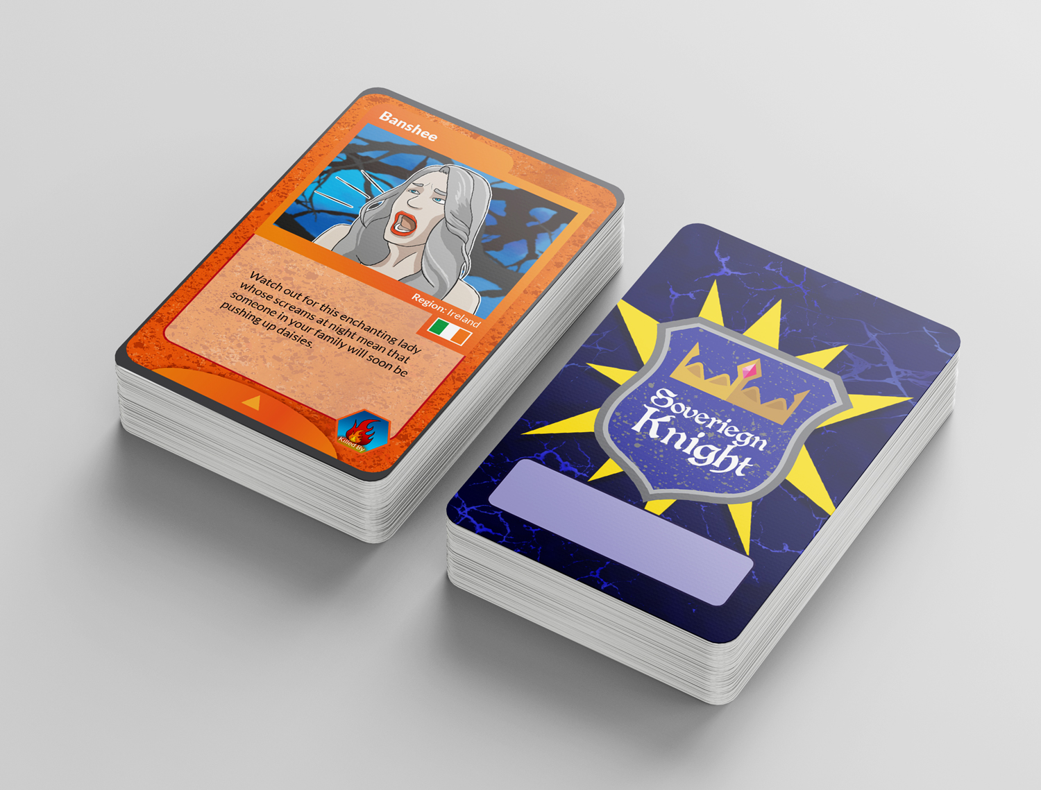
The family really wanted some sort of crest or shield to be the main focus of the logo for the game. Since the main characters were the White and Golden Knight, they also wanted it to have a royal theme and after going through a few different crest shapes, crown shapes, and color palettes, we landed on a palette that used the royal colors of silver, gold, and purple. The font choice was something that reflected the style used in many renaissance fairs.
3. Card Design
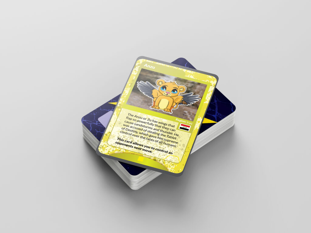
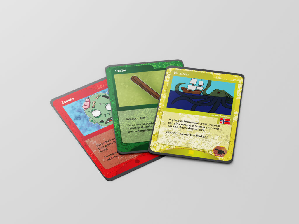
The way the game works is that some cards can be defeated by certain tools or weapons, so we had to create “sets” of cards to distinguish each set. We did this by using four colors for the backgrounds (red, green, yellow, orange) and also shapes (orange cards had a triangle at the bottom, red cards had a circle) – the simplicity of colors and shapes were used to help the children to easily distinguish each set of cards.
Creating an area on the cards for the flag of the nation the creature originated was also important to the family, so we used a standardized spot below the image to have room for each flag and country name. A short description of each creature was on each card, as well as an icon that shows which weapon will “kill” that creature.
A few special cards were also added with perks such as “control your oponent’s next turn” or “no weapon can kill this card, but it can only be used once”.
If two cards “tied” in their strengths, a coil flip was needed so we also developed small cardboard coins that would be included with the packs.
4. Challenges
Part way through development, while the kids were testing the game out with cards made simply from pieces of paper, we realized that the nature of the gameplay meant it was hard to keep track of which cards were yours. To solve this issue, we came up with the idea of including a small area on the front of each card where kids could write their names using dry erase markers. Since the game was no longer just cards, we decided the game would have two buying options: card packs and a starter pack. The starter pack would come with a dry erase marker, the cardboard coins, as well as a pack or two of cards to get kids started with the game.
The ability to use a dry erase marker meant the cards had to be finished with a particular coating so that the kids could wipe off their names if they wanted to trade cards. We ended up working with a local printing company to devise the best solution for printing the cards in a way that made sense from a cost standpoint as well as meeting the needs we had. The family wanted to produce the game entirely within Canada so this meant it was a bit tougher to strike the balance between cost and quality.
Not only that, but most of the local printers had 0 experience printing something like trading cards, so we had to work with them to come up with a solution that would fit our needs. Sending them off to china to be printed as “playing cards” was obviously the easiest option but part of the marketing we wanted to use was “created and made in Canada”.
5. Moving Forward
Once the cards were printed, we also created a sticker to be placed on the package. At least during startup, the family purchased a heat sealing machine and were packaging the cards themselves, so having a sticker to quickly slap on the packages was helpful. We also developed a few tradeshow banners that the family could use to display at the local booths they had purchased at markets. We developed a poster to hang in a local comic shop that agreed to sell the cards on behalf of the kids.
Once they have more experience selling locally the young boy is determined to get himself onto Dragon’s Den to pitch his game to the dragons in the hope of getting more funding to expand his game.
Outcome
This project is still ongoing, but it has been a long and very enjoyable process. Working with this family was a blast and I am so inspired by this boy’s creativity and determination to get his game out to the world.